Brand Refresh for Higharc
Higharc was initially launched as a B2C, direct-to-homeowner product. As such, its initial brand was aspirational, friendly, and approachable in order to attract home buyers.
In late 2021, I became the first marketing leader at Higharc. By then, the customer base had shifted to production homebuilders, who sought a solid return on investment. Soft, friendly visuals weren't enough to instill purchasing confidence. Higharc required a brand refresh to appeal to the right clientele and reflect its future direction.


Blue sky 🌤
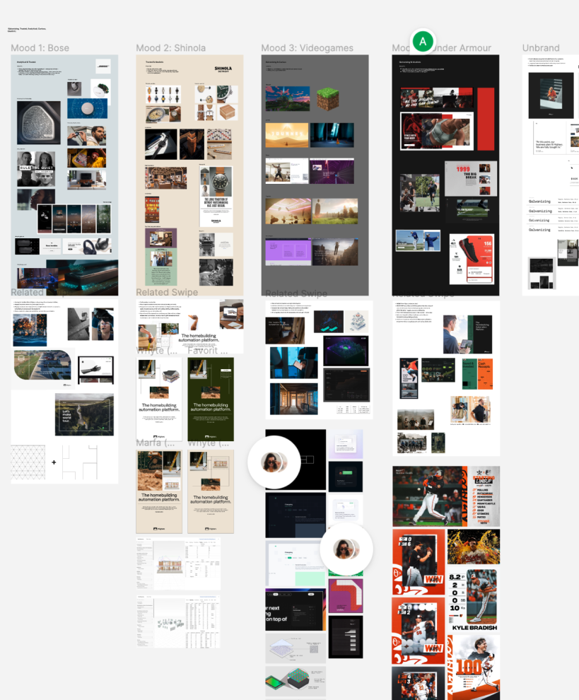
We started big picture and explored vastly different visual avenues…
A video game-inspired UI & color palette to lean into Higharc’s tech-forward nature
An “unbranded” approach with no color and no distinct characteristics to dampen “disruptor flashiness”
An American-made “heritage” approach to celebrate the customers as highly skilled craftspeople
A vibrant, color-forward approach to galvanize customers into taking action
… plus a half dozen more
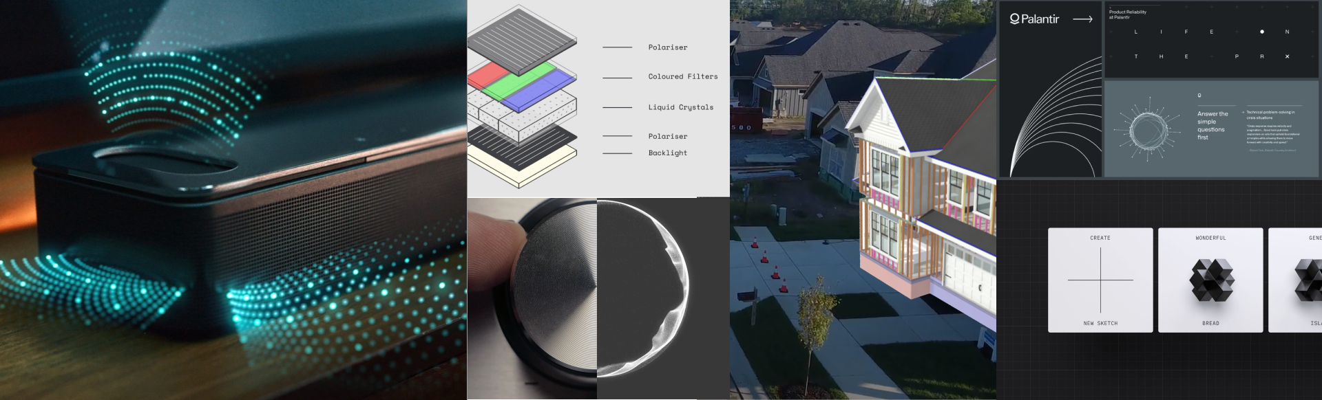
The “Intangible”
The chosen design direction positions Higharc as a digital overlay to drastically optimize existing businesses. It meshes digital and physical realms to galvanize the connection between data modeling and real business results.
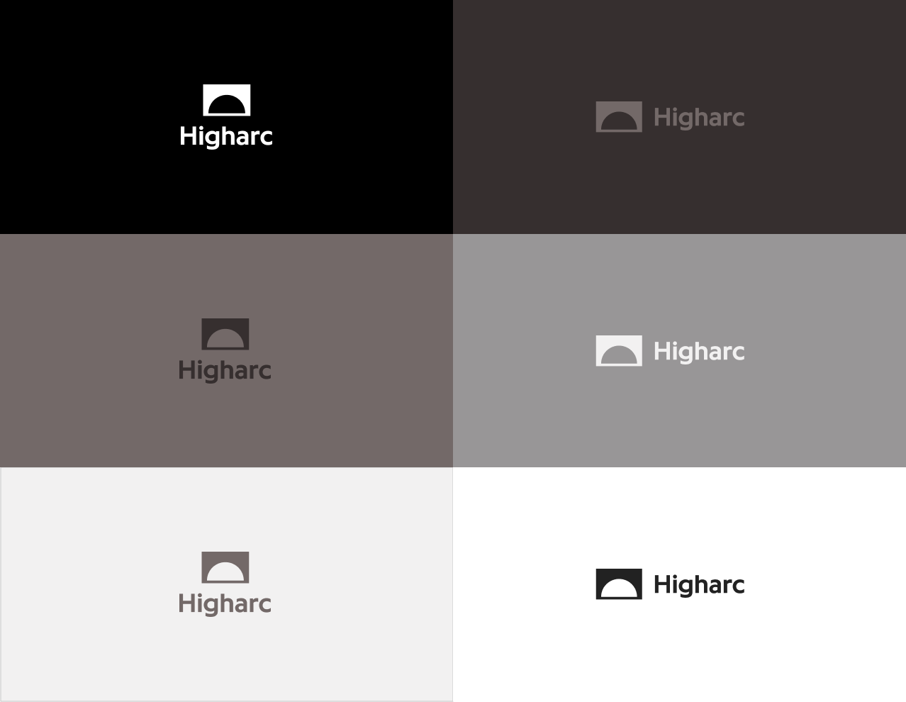
Logo
Keep what’s working. The Higharc logo had three years of industry recognition and was flexible enough to see Higharc through to the new phase of its brand, with a few color palette adjustments.
Color
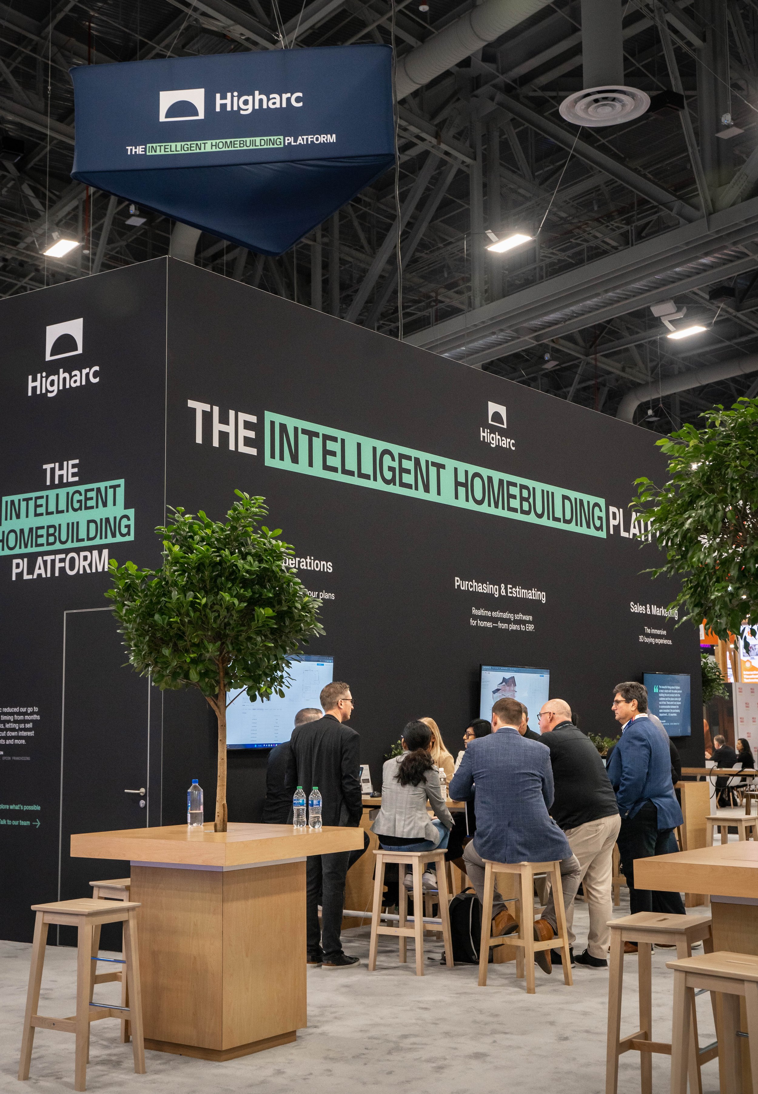
High Tech Dirt and Nano Green make up Higharc’s color palette.
High Tech Dirt's warm brown base references building site roots. It radiates strength and visualizes the cross-section of organic material and cutting-edge technology.
Nano Green is the cursor in a dark terminal — the blade of grass in the front yard. It’s organic and also backlit, injecting energy and contrast as a constant accent.
The distinct and powerful dynamic created with these two color families communicates energy and synergy between Higharc's audience and their high-tech value prop.

Typography
Higharc’s initial brand typeface, Circular, provides a solid foundation throughout the product and moves to a supporting role in marketing content.
Enter PX Grotesk, the new hero typeface, confidently intertwining typography and pixelated screen language. The hybrid shapes resulting from embedding a pixel-grid structure into an optically adjusted drawing create an unprecedented aesthetic, with solid grotesque roots and superb legibility on screen and in print. Using a digital-looking typeface reinforces Higharc’s disruptive approach to solving outdated and digitally siloed building issues.


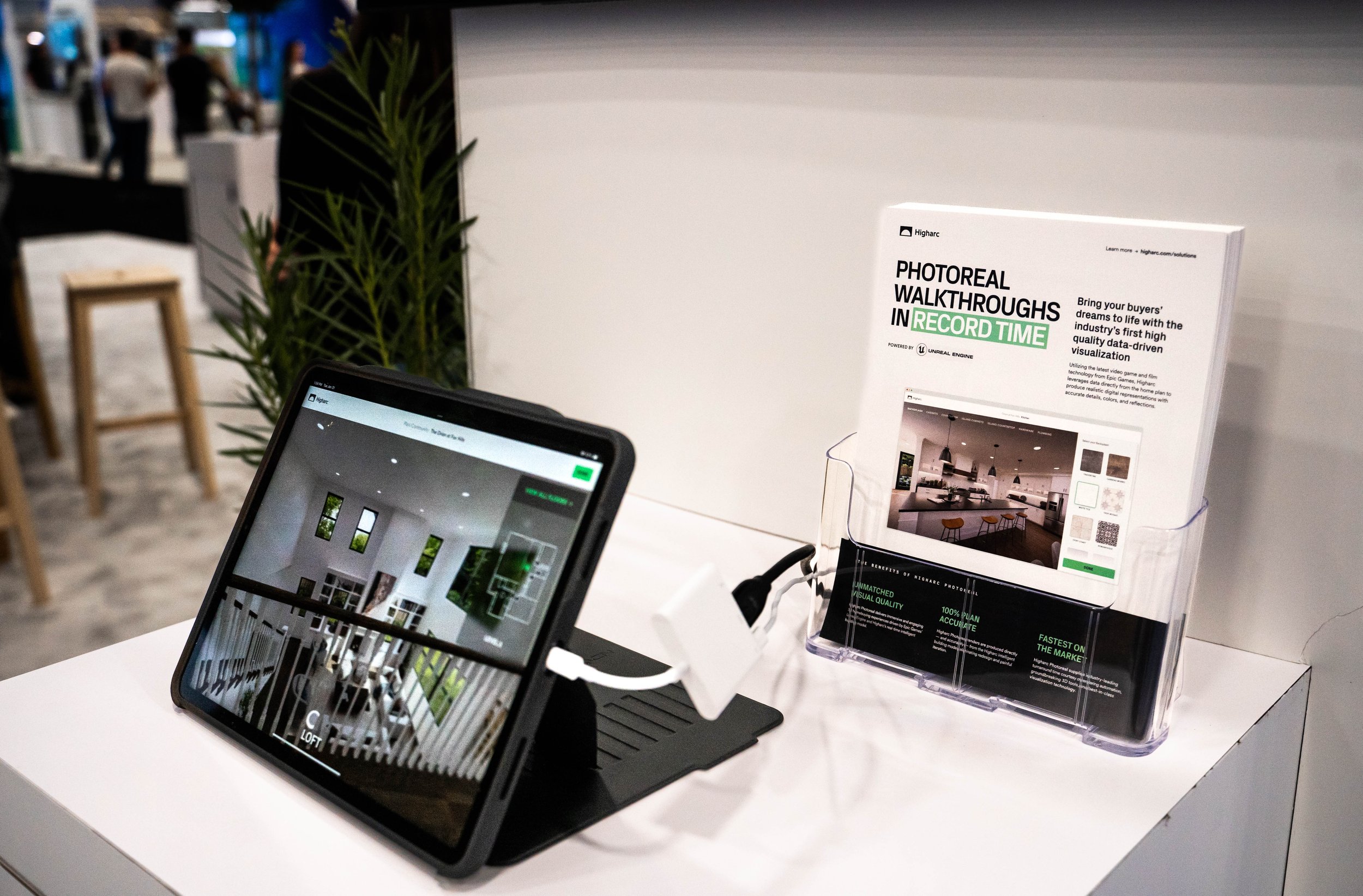
The highlight
Why highlight? Technical information can be dense, and Higharc strives to make things easy.

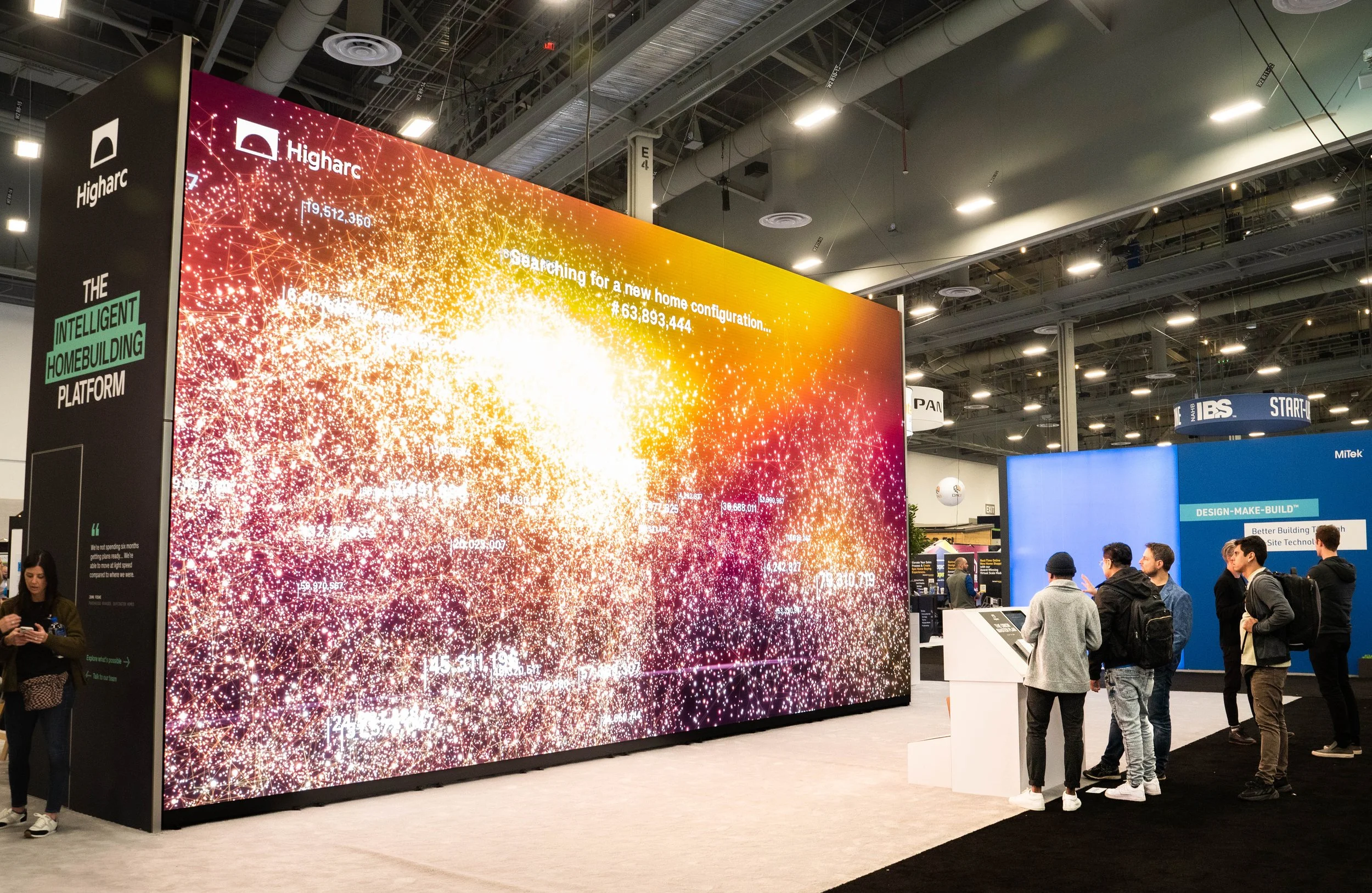
Meshing
“Meshing” demonstrates how Higharc optimizes work in the field, balancing complicated information with clear value propositions. This strategy shows Higharc as a digital force that powers construction sites, business planning, supplier negotiations, and more.